A guide to creating a color palette for your wedding.
How to create a color palette for your wedding.

"The color that is love is my favorite color" - Malou
The Venue plays an important part of color design. Pantone, is a company known for its matching system of color used by a variety of industries such as the fashion industry, graphic design, product design and manufacturing. It is the most famous site for color matching. Many of Pantone's color creations come from the environment, their inspiration. You’ll still want to visualize your destination when selecting a palette to work with. It should be a reflection of you.
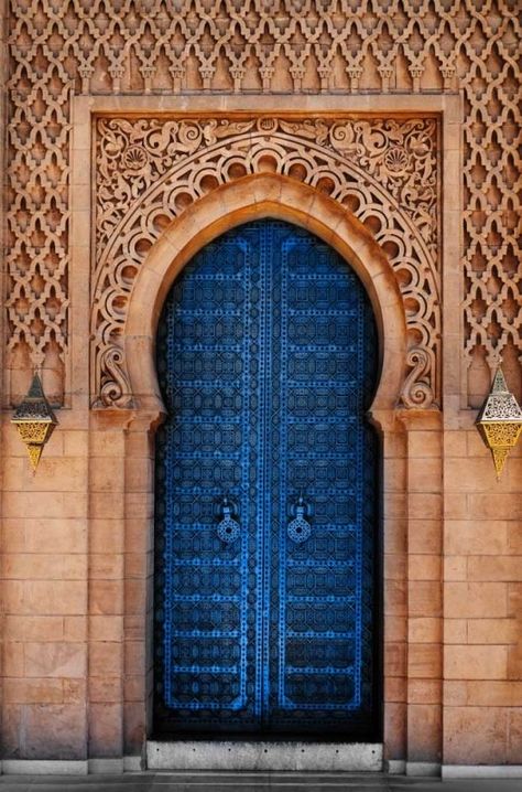
Inspiration is key. Don’t rush just yet to Pinterest to find other boards that you may like. First, find your true passion from a symbol of love, swath of fabric, an heirloom, a piece of artwork or even an item from your closet. Find at least one main color, or the "Hero" color, that you are in love with then you can consult Pinterest or use a color generator to compliment your main color. Your "Hero" color will be the main color or interest. Try to stay within a 3-5 color selection for your custom palette. Using too many colors can confuse guests and color has a way of competing with each other. The wedding planner, especially if she has a design background, can take all of the guesswork out of creating a perfect palette that reflects your vision and the venue. Designers have experience in esthetics of color or the psychology of color and how people feel being stimulated by certain colors. Color generators such as coolors.co, colorhunt.co, and colrd.com, are some great apps to help generate a beautiful palette. Even Canva.com has pumped up their design game and technology with custom palettes. Many programs such as these make it easy for an individual to generate palettes, without having the knowledge of design programs.

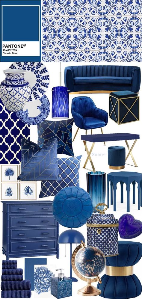
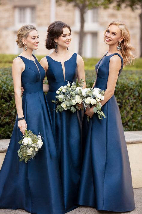
The Color of the Year can play an important part when creating a palette. “Classic Blue,” is Pantone’s color of the year for 2020. Even if you don’t like “Classic Blue,” you can incorporate an element to stay on trend or use a shade that is from the same family you are working with as a detail.
AI (Artificial Intelligence) Aqua is the color of the year for 2021, according to Pantone and boy is it a beauty! It will be crazy easy to use AI Aqua at your destination wedding on the Caribbean. Think Cancun, Playa del Carmen, and Tulum, as the color of the year for 2021! It's a shade derived from the dreamy tones of these iconic waters! I'll be doing a blog in 2021 on that amazing, favorite color of mine.

Think seasonally. For summer weddings we tend to think of bright, vivid colors, like the color of watermelons, mangos, kiwi and lemonade. In the fall, we think of the changing of the leaves, from green to orange, to red and sometimes purple. Persimmon, yam and citrus are beautiful fall colors and on trend. In the winter, I see couples playing off stark white with teals, gold, deep reds, rich purples and even using black, which has become more and more popular. In spring, we see the blooming of trees as in sage, as well as light pastels and neutrals.

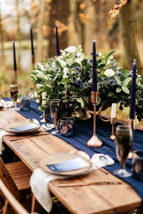
Some couples like to keep the setting entirely neutral, while some want to add a splash of color, whether vibrant or subdued, as in a colored gauze or linen napkin, runner or custom tablecloths like velvet and heavier linens. Tropical patterns whether neutral or vivid are very big right now, especially with destination weddings. I always keep a chart handy of the colors in-season, when I am designing a wedding, and we love assisting guests with details and customized elements, like stationery, menus and seating cards, and welcome boards, runners and displays, as well as custom textiles and welcome bags.

On the day of the event, it's all about what a couple envisions for their special day that inspires us to dive deeper into the world of color to offer couples an extra-ordinary experience and guidance.


